How to Color Your Illustrations Faster and More Efficiently?
Hey, artists! 🎨
Let me start with a confession: I used to suck at colors. Picking the right colors for an illustration was always a struggle. I’d spend hours deciding on a palette, only to realize later that the colors didn’t work as well together as I’d hoped. Worse, everything was painted directly on my characters, so when I wanted to make changes, it was too late. Sound familiar?
But those frustrating days are behind me. I’ve found a method that not only makes switching colors during the process super easy but also allows me to create infinite color combinations that actually look good together. And today, I’m sharing this simple trick with you. Let’s dive in!

1. The Secret to Unified Colors
One of the most important things to keep in mind when working with color is this: your characters and backgrounds need to feel like they belong in the same world, in the same illustration.
If the colors clash or feel disconnected, your whole piece can look wrong. The key to making everything feel cohesive?
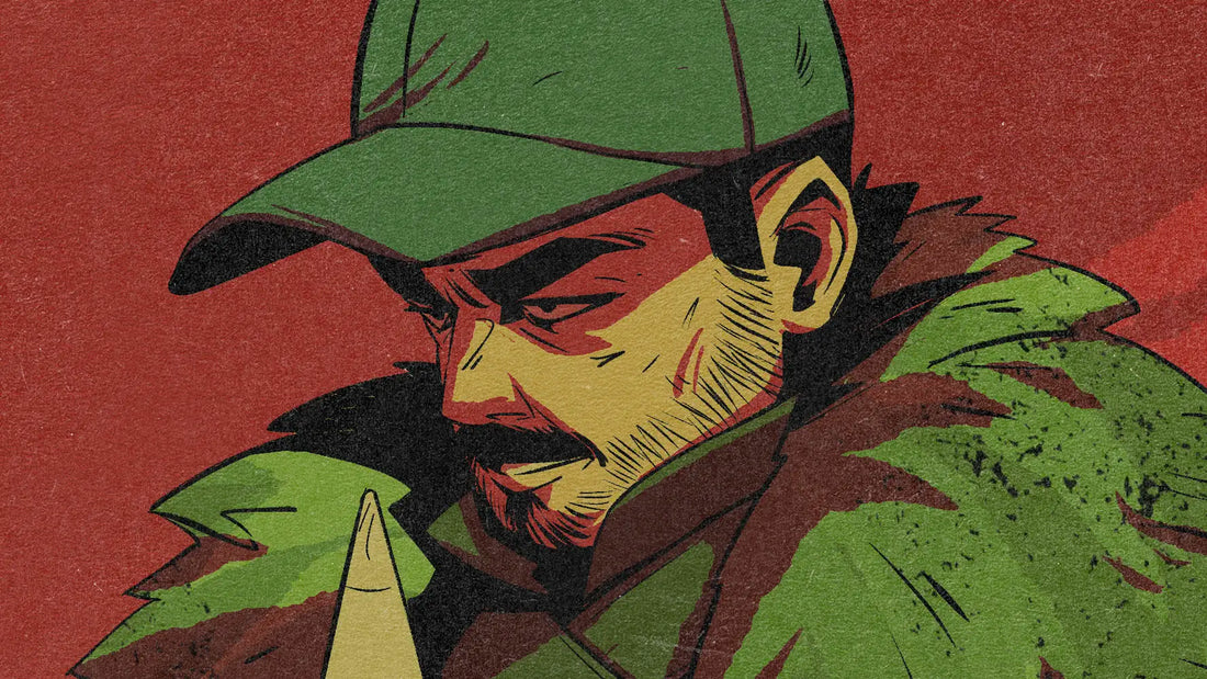
- Using the same color for the background and the shadows of your character - if your background color is red, then your shadows should also be red.
By doing this, your characters will naturally feel like they’re a part of the scene, rather than pasted onto it. The layer setup I’m about to share is perfect for this system because it allows you to control each element individually:
- The background color.
- The shadows of your characters.
- The lighting on your characters.
Let me show you how it all comes together.
2. The Simple Layer Setup
Here’s a simple screenshot from my painting software (in this case, Photoshop), where you can see the layers I used directly to paint this illustration:

Let’s break it down:
- Base Colors Layer (Normal mode) - Background: This is the foundation where I fill in the flat colors.
- Tinting Layer/Filter Layer (Overlay mode): Adds a “filter” over the base colors, to unify the palette.
- Base Colors Layer (Normal mode) - Character
- Shadows Layer (Multiply mode): Adds depth and integrates the characters with the background by applying the similar color (from the Tinting Layer) to the shadows.
- Lighting Layer (Overlay mode): Enhances the atmosphere and highlights, giving the piece its final mood.
If this looks a bit complex at first, don’t worry! Here’s a simplified view:

As you can see, it’s actually very simple. The system only requires three layers after separating your character and background:
- Tinting Layer (Overlay)
- Shadows (Multiply)
- Lighting (Overlay)
That’s it! With these three layers, you can adjust and experiment as much as you like without starting over.
3. Color Selection: The Science Behind It
Now that you know how to set up your layers, it’s time to choose your colors. This is a science in itself! For the longest time, I overcomplicated colors and didn’t know what to pick to make my illustrations look good. But then I went back to the fundamentals and realised: the color wheel is your best friend.
Let’s look at some examples:
Complementary Colors
Using colors from opposite sides of the wheel
- Orange and blue

- Violet and yellow

- Red and green

- Magenta and green

Complementary colors are incredibly versatile. To show how they work both ways, take a look at next image—it flips the roles from the previous image, creating the same eerie feeling but with a completely different appearance.

4. What If Complementary Colors Are Too Complex?
I get it—complementary colors can sometimes feel overdone. They’re everywhere: movies, games, illustrations—you name it. That’s where monochromatic palettes come in.
Take a look at the next image. A monochromatic palette uses shades of a single color, offering a clean, focused look. This approach is perfect for creating a striking visual.

- Pros: It’s simple and conveys a clear feeling.
- Cons: Overusing monochromatic palettes can make your art feel repetitive or bland.
That’s why I often recommend analogous palettes instead.


- Analogous palettes use colors next to each other on the color wheel, creating harmony and consistency.
- They’re more versatile than monochromatic schemes and less flashy than complementary colors, making them ideal for subtle, polished illustrations.
5. Perfect for Comics and Beyond
If you’re a comic artist, you know how challenging it can be to maintain consistency while keeping each panel fresh and engaging. This technique is a game-changer because it gives you full control over the mood and colors of every panel without having to start from scratch.
Adjust Mood Across Panels with Ease
Comics often shift between different emotions and settings—one moment you’re in a tense battle scene, and the next, you’re in a serene, reflective moment. With this layer setup:
- You can easily adjust the lighting and shadow colors to match the mood of each scene.
- Tweaking the Overlay and Multiply layers lets you experiment with warmth, coolness, or even dramatic shifts without redoing your base illustration.
Consistency Is Key
Another challenge in comics is ensuring your characters look consistent throughout the story. This method allows you to:
- Use the same base colors for your characters while varying the lighting to match the scene.
- Keep backgrounds cohesive by applying a unified palette, ensuring that all elements feel like they belong in the same world.
Works Beyond Comics
This setup isn’t just for comics. It’s also fantastic for:
- Concept art, where quick iterations are key.
- Storyboarding, helping you communicate mood shifts efficiently.
- Animation pre-production, where maintaining color consistency across frames is crucial.
With this approach, you can focus on storytelling and creativity instead of worrying about whether your colors match or how long revisions will take.
6. Tools to Make It Even Easier
All the illustrations in this post were made with my brush packs! Whether you’re using Procreate, Clip Studio Paint, or Photoshop, these brushes are perfect for creating stunning effects quickly and easily.
Ready to Transform Your Art?
I hope this inspires you to simplify your workflow and experiment with colors. I’d love to see what you create using this method—tag me on social media so I can check it out!
Happy illustrating,
Lucas
Let me know if there’s anything else you’d like to tweak or expand! 😊


