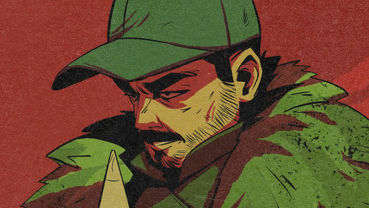
How to Paint a Portrait in 7 Steps
Painting portraits has always been one of my biggest passions. There’s something fascinating about capturing the likeness and emotion of a person — it’s both incredibly rewarding and very challenging.
To make the process simpler for myself and my students I like to divide my painting workflows into simple steps. Here are my 7 simple steps to paint portraits:
Wanna Learn more about drawing portraits? Check out my full course: How to Draw Faces Like a Pro.
Step 1: The Sketch
Every great portrait begins with a solid sketch. For this one, I wanted a more realistic approach, so I used the Reilly rhythms method (look it up — it’s a fantastic way to establish structure and proportions).
I usually warm up by sketching the model several times in different poses before committing to a final drawing. This helps me understand her proportions and get my hand moving.
Tip: Don’t rush through this stage. If the sketch doesn’t feel right, the painting won’t either. Fixing construction issues later will cost you hours.
For the sketch, I used the LP Sketching: Charcoal Soft Brush (this brush is from my Upcoming LP Sketching brush pack, but for now it’s still in testing). I like working in a reddish tone so the lines blend softly with the skin tones as I paint.

Step 2: Base Colors
With the sketch ready, I block in the base colors on a layer beneath it using the LP Portrait Flat brush. This brush has a subtle texture that feels natural and painterly.
I also designed a simple background at this stage. The background isn’t just filler — it’s an essential part of the composition. For example, I placed a lighter tone behind the shadow side of the face to create contrast and draw attention to the portrait.
When choosing base colors, avoid extremes (too dark, too saturated, too light). Aim for neutral midtones that will give you room to push values and colors later.
I made each element on its own layer - creating masks that will later on help me keep my process organised and easily managed.

Step 3: Color Variations in the Skin
Skin is never a flat color. It’s alive with subtle variations — reds, greens, yellows, even blues. If you study great portrait artists, you’ll notice these colors are often exaggerated but still feel natural.
I made mine with the LP Portrait Dusty brush, because it makes these gradients of color easy to apply.
If you don’t know where to start with these colors, here are some pointers:
-
Redder tones: cheeks, nose, ears, joints (like fingers and elbows).
-
Yellower tones: forehead.
-
Cooler/green tones: jaw and around the mouth.
This stage is about adding richness and believability to the skin tones.
Avoiding this step can make your portraits look dead and uninteresting, so I would really recommend trying to incorporate it into your workflow.

Step 4: Light and Shadow (Layer Modes)
Here’s where the portrait really starts to take shape. I establish the shadows first, then the light using layer modes:
-
Multiply layer → for unified shadow shapes (using background tones).
-
Second Multiply layer → to push deeper darks.
-
Soft Light layer → for cool light hitting the front of the model.
-
Overlay layer → for skin highlights on the forehead, cheeks, and nose.
-
Color Dodge layer → for bright, punchy specular highlights.


Brushes used here:
-
LP Portrait Flat for strong shapes.
-
LP Portrait Dusty for smudging and creating soft transitions.
Step 5: Overpainting & Detailing
This is the longest step — where I merge everything and bring the portrait to life. Using mostly the LP Portrait Wet brush, I refine details, blend transitions, and emphasize key features.
The beautiful thing about these brushes is that they also work as smudgers. The LP Portrait Dusty is particularly powerful for smooth blends, while LP Portrait Bristle is perfect to add texture and life to areas like hair.
Tip: Don’t try to replicate every detail from reality. A good portrait isn’t a photograph — it’s an interpretation. Decide what matters most and emphasize it.

Step 6: Adjustments (Liquify & Likeness)
Even with careful planning, proportions sometimes drift. At this stage, I use the Liquify tool and flip the canvas to check the likeness.
I would recommend doing this way earlier and throughout the process. You can check it first at the sketching stage and then at the end of every step - to keep yourself accountable and to not let the painting progress into the wrong direction for too long.
This is also the time to exaggerate features you want to emphasize. In this portrait, I pushed the model’s naturally large eyes slightly more, giving the final painting a subtle stylized feel.

Step 7: Final Effects & Textures
The last step is where a digital portrait is finally cleared of its "artificially digital” look and takes on the warmth and imperfections of a traditional painting. This is where I integrate textures and finishing effects using my LP Traditionalizer 2.0.
The pack includes textures in 2K, 4K, and 10K resolutions:
-
2K → Great for small sketches or social media work.
-
4K → Ideal for mid-sized illustrations (like this portrait at 2900 × 3780px).
-
10K → Best for large-format printing, but be aware the files are heavy in size (both dimensions and MB).
For this project, I worked with the 4K textures, which were large enough to cover my canvas without obvious repetition or tiling.
I usually apply textures as separate layers above the painting, each with a specific blending mode to achieve different effects:
-
Overlay Layer – I used the Overlay Acrylic Brushed here. This simulates the look of dry brush strokes catching on the “tooth” of the canvas.
-
Screen Layer – Applied with the Screen Board Dry, this layer creates the illusion of a woven canvas beneath the paint.
-
Multiply Layer – Here I used Multiply Board Dry to bring a warm undertone into the piece.

In addition to full overlays, I selectively add texture using the 10 brushes included in Traditionalizer 2.0. These brushes allow me to “paint” the texture exactly where I want it, giving me more control than global overlays.

This layered approach means no two paintings ever look the same — each portrait has unique “imperfections” that mimic traditional media.

Final Thoughts
Portrait painting is a lifelong journey, and every piece is a new challenge. The process I shared here — from sketch to final effects — is just one of my personal workflows, but the key is to find what works best for you.
Hope this makes your next painting a bit easier. Let me know your thoughts.